

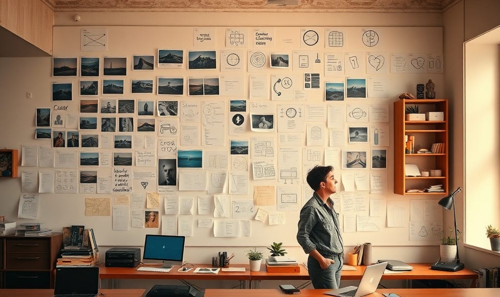
If you’ve read some of my previous articles here on Substack or on my PerformaGo Diary blog, you’ll know already that something called Information Mapping has played a big part in my professional life.
It’s an approach to structured writing that was created by someone called Bob Horn. I had the pleasure of meeting Bob a handful of times in the early noughties. By that time, his focus of interest had moved on and he was working on something he called Visual Language.
Given that his earlier work with Information Mapping had been primarily focused on the organisation of text-based information, it was interesting to see him move his attention to a more visual representation of content.
Bob graciously allowed me to take some time to look at his Visual Language training to see if we might be able to offer it as a complement to our Information Mapping training.
At the time, I came to a couple of conclusions.
First, the Visual Language method was rather esoteric. It wasn’t easy to teach and understand in the way that Information Mapping was. Without some re-working, I couldn’t honestly see it resonating with clients.
Second, (and more important) even with an easier to understand method or framework, the ‘How do people actually create the visuals they want?’ seemed like an insurmountable obstacle to me.
At the time, Bob was fairly confident that clip art was becoming good enough to meet quite a bit of this need. I remained sceptical; but I never stopped thinking about a day when the creation of really good quality visuals might somehow be in reach of most people.
Of course, back then, I’m pretty sure I had never even heard the term AI. Or if I had, it would have seemed so sci-fi that I wouldn’t have given it more than a couple of seconds thought.
So, twenty years ago, I never really had any clear idea about how that dream of readily available visuals might be realised; but now, of course, I do. Because that dream has definitely become a reality.
And the question is no longer, ‘How might we give everyone easy access to great visual design?’ It’s much more about, ‘How do we enable people to make the best use of this new resource they have available to them?’
A Different Kind of Language
Before going any further, it’s probably worth explaining a little more about what Bob meant by Visual Language. His definition was surprisingly simple:
“The integration of words, images and shapes into a single communication unit.”
If you know anything about Information Mapping, that phrase “communication unit” will probably sound familiar. Information Mapping was built around the idea that information could be organised into meaningful discrete units and then combined into larger structures.
Visual Language felt like an attempt to extend that thinking into a world where words, graphics, diagrams, icons and other visual elements worked together as a unified whole.
Looking back now, I think I understand far better why I was concerned about it not resonating easily.
Information Mapping was heavily influenced by cognitive learning principles and, whether consciously or not, most of those principles were operating within a largely text-based world. Information could be chunked. Labelled. Structured. Sequenced. Categorised.
Visual communication doesn’t always behave like that.
Images certainly contain structure. There are principles, patterns and conventions that can be learned. But visual meaning often emerges from the relationships between things rather than from the things themselves. Things like the:
placement of objects.
composition of a scene.
use of colour.
perspective.
relationship between foreground and background.
continuity from one image to the next.
The more I think about it, the more I wonder whether Information Mapping and Visual Language were tackling two fundamentally different kinds of communication problem.
One was primarily concerned with organising information. The other was trying to understand how people construct meaning from what they see.
And perhaps that’s why Visual Language felt harder to teach. Not because it was no good. But because most of us never really learn to “speak” visually.
We spend years learning how to read and write. We learn how to organise ideas into sentences, paragraphs and documents. Yet we receive remarkably little formal education in how visual communication works. Which is slightly ironic when you consider how much of our daily lives are spent consuming visual information.
At the time, however, that was not my biggest concern. My biggest concern was much simpler. Even if somebody understood visual communication, how exactly were they supposed to create all these visuals?
Twenty years ago, the answer generally involved a designer, illustrator, photographer or artist. Most L&D teams didn’t have easy access to any of those.
The Problem Disappears
Of course, as noted earlier, things look very different today. There’s no question that AI can produce amazing images. In many respects, it has solved the production problem that seemed so daunting all those years ago.
But solving one problem has revealed another.
The New Challenge
A couple of weeks ago, I found myself working on a fairly ambitious e-learning scenario that required a large number of AI-generated images. Even before I started, I knew consistency was likely to be one of the biggest challenges.
Most people who have experimented with AI image generation already know that creating a single impressive image is relatively easy. Creating a series of images that all feel like they belong to the same world is much harder.
My assumption was that the solution would largely come down to prompting. If I could:
describe the characters clearly enough
define the locations in sufficient detail, and
learn the right prompting techniques
then, surely, I could create the consistency I was looking for.
And to some extent, that proved true. Better prompts certainly helped. But as the project progressed, I found myself becoming increasingly uncomfortable with the direction I was heading. The more I focused on prompt refinement, the more it felt as though I was trying to hold an entire visual world together through increasingly detailed instructions.
The reality was that a character wasn’t just a character. They had a specific appearance. Specific clothing. Specific relationships with other characters.
Likewise, a hotel bar wasn’t simply a hotel bar. It had a particular layout. A particular atmosphere. Specific visual features that needed to remain recognisable from one image to the next.
The World Behind the Images
Gradually, I realised I needed to think about the problem in a different way. It wasn’t just about improving prompts. It was about maintaining a coherent world.
And once I looked at the challenge through that lens, something became obvious. The consistency had to come from the world that existed behind the prompts.
And that, as it turns out, is where things start to get really interesting. More on that next time.
Until then,
Andrew
PS: One of the recurring themes throughout Learning Re-Framed is that tools rarely remove the need for judgement. They often shift where that judgement needs to be applied.
Whether we’re thinking about visual communication, e-learning design, classroom learning or performance support, the challenge is rarely just about mastering the technology. More often, it’s about understanding the underlying principles that make those tools effective in the first place.
Much of the Learning Re-Framed public programme is built around exploring exactly those underlying principles — helping L&D professionals look beyond techniques and technologies to the deeper design decisions that influence workplace capability.